How to Convert a Design or Screenshot Into an Email With AI

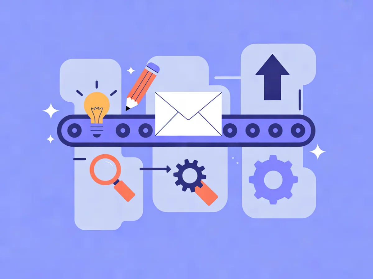
You can convert a design or screenshot into an email with AI, but the reliable path is not "upload image, get pixel-perfect HTML." It is: read the reference, describe its structure in words, let the AI build block-based HTML, then fix the parts that break on mobile and in the inbox. That workflow takes about twenty minutes for a simple layout and produces something you can actually edit, test and reuse.
What you'll set up and what you need
There are two realistic starting points. Either you have a visual reference — a screenshot of a competitor's email, a template you liked, a Figma export from a designer — or you have nothing but an idea and a rough sense of the layout you want.
Both work, but they work differently. An AI email builder can produce a complete responsive design from a written description, along with subject lines and preview text. It cannot look at a screenshot and reproduce it pixel-for-pixel. What it can do is take your description of the structure — hero, headline, one button, three product cards, footer — and build those blocks as editable HTML.
Before you start, have these ready:
- A reference image, or a written description of the block order
- Your brand assets: logo file, hex colors, font names
- A sending domain with DKIM, SPF and DMARC configured if you plan to send, not just design
- A plan that covers your AI action usage — the Free plan includes 100 AI actions per month, and paid plans start at $14.90/month
That last point matters more than people expect. Generating a design, regenerating a section, and generating subject lines all consume actions, so it helps to know your ceiling before you iterate ten times on a hero block.
Step-by-step: from reference to send-ready email
Step 1: Prepare the reference
Crop the screenshot to the email body only. Browser chrome, navigation bars and sidebars confuse block detection and produce junk sections you'll delete anyway.
Then write down the block order in plain language:
- Hero image, full width
- Headline, centered
- One paragraph of body copy
- Single CTA button
- Three product cards in a row
- Footer with social links and unsubscribe
Note the hex values and font names if you can read them from the source. If you can't, describe the feel — "warm off-white background, dark green button, serif headline" is enough to start.
How to verify: you should be able to read your notes out loud and have someone else picture the layout. If your notes are vague, the output will be too.
Step 2: Write the description prompt
This is the step that determines the quality of everything after it. Give the AI four things: the block sequence, the goal of the email, the audience, and the tone.
A prompt that works:
Build a product-launch email for a small skincare brand.

Audience: existing customers who bought once in the last six months.
Goal: get them to view the new serum and click through to the product page.
Tone: warm, direct, no hype.

Structure:
1. Full-width hero image, dark background
2. Centered headline, max 8 words
3. Two short sentences of body copy
4. One centered CTA button, dark green
5. Three product cards in a row, each with image, name, price
6. Footer with social links and unsubscribe

Keep it mobile-first: columns should stack, button should be full-width on small screens.
How to verify: reread your prompt and check that every block you want is named. If you forgot the footer, you'll get an email without one.
Step 3: Generate the design
Run the prompt through the AI email builder. You get back a complete responsive design plus subject line and preview text suggestions.
Treat this as a first draft, not a finished email. The value is that you skip the blank canvas — you're now editing rather than building from zero.
How to verify: open the generated email and count the blocks. They should match your prompt's structure. If a block is missing or duplicated, regenerate or add it manually rather than fighting the output.
Step 4: Review the blocks in the visual editor
Open the design in the visual block editor. You'll see the standard block types — headings, heroes, products, columns, social links — and you can swap, reorder or delete any of them.
This is where the image-to-HTML email idea becomes concrete. The AI didn't hand you a flat image; it handed you a stack of editable blocks. That's what keeps the result responsive and accessible, and it's why the output is worth more than a screenshot of a design.
How to verify: click into each block and confirm you can edit the text and image. If something is locked or rendered as a single image, replace it with a proper block.
Step 5: Replace placeholder copy and images
The generated copy is a scaffold. Keep the hierarchy — headline length, paragraph rhythm, button placement — and replace the words with yours. Same for images: swap in your product shots at the same aspect ratio so the layout doesn't shift.
How to verify: read the email as a recipient. If any sentence sounds like it was written by a template, rewrite it.
Step 6: Set the mobile behavior
Check three things on a narrow viewport:
- Multi-column rows stack into a single column
- Hero text stays readable against the image (add a dark overlay if it doesn't)
- The CTA button goes full-width and stays tappable
How to verify: preview at 375px width. If the product row stays three-across, set the columns to stack.
Step 7: Save it as a reusable template
If you'll send this layout again — a monthly product drop, a recurring newsletter — save it as a reusable template. Next time you change the content blocks only, which takes minutes instead of an afternoon.
How to verify: create a new campaign from the template and confirm the structure loads intact.
Step 8: Send a test
Send to yourself and to at least one inbox on a different provider. Gmail and Outlook render differently, and you want to see both before your list does.
How to verify: the test arrives, images load, links work, and nothing is cut off in the preview pane.
A worked example: recreating a product-launch email
The following is an illustrative scenario, not a real customer story.
A marketer at a small skincare brand sees a competitor's launch email: dark hero image, one headline, one button, three product cards, a short footer. She wants that structure with her own brand.
Her prompt names the block order, her audience (repeat buyers), her goal (click through to the new serum page), and her tone. The AI returns a hero block, a heading block, a text block, a button block, a three-column product block, a social links row and a footer.
What she changes:
- The competitor's copy becomes her own two sentences about the serum
- Product images become her three SKUs, cropped to the same ratio
- The button color changes from the generated default to her brand hex
- The footer social links point to her accounts
One thing breaks. The three-column product row stays three-across on mobile, so each card is roughly 110px wide and the product names wrap onto four lines. The fix is in the column block settings: set the row to stack on small screens. After that, each card takes the full width and the names fit on one line.
The final block order: hero, headline, body, button, three stacked product cards, social links, footer. Nothing exotic — which is the point. The reference gave her a structure, not a design to copy.
How to check it actually works
Design review and deliverability review are separate jobs. Do both.
Render testing. Check the email in Gmail, Outlook, Apple Mail and at least one mobile client. Outlook is the usual source of layout surprises.
Accessibility. Every image needs alt text. If images are blocked — which is common — the email should still make sense.
Plain-text fallback. Confirm it isn't empty and doesn't contain leftover placeholder text.
Links. Click every one, including the unsubscribe. A broken unsubscribe is a compliance problem, not just an annoyance.
Preview text. Make sure it doesn't repeat the subject line word for word. It's prime real estate, not an echo.
Inbox placement. On a fresh domain, send to a few real addresses first and confirm the email lands in the inbox rather than spam. Mailerflow's guided DKIM, SPF and DMARC setup with automatic verification handles the authentication side, and warm-up limits help you avoid burning a new domain's reputation.
After the first send, Mailerflow shows analytics for delivery, bounces, complaints, clicks and approximate opens per campaign. Use clicks as your layout signal — if the button placement works, clicks will show it. Opens are approximate because image blocking and privacy features affect tracking, so don't read too much into small differences.
A checklist you can copy:
- [ ] Renders in Gmail, Outlook, Apple Mail, mobile
- [ ] All images have alt text
- [ ] Plain-text version is complete
- [ ] Every link clicked, including unsubscribe
- [ ] Preview text differs from subject line
- [ ] Test landed in inbox, not spam
- [ ] Columns stack on mobile
- [ ] CTA is full-width on small screens
Common mistakes and how to fix them
Treating the AI output as final. It's a first draft with correct structure. Fix: budget ten minutes for editing every generated email.
Pasting a full-page screenshot. Navigation, cookie banners and browser chrome get read as content blocks. Fix: crop to the email body before you describe it.
Building the whole email as one large image. It can't reflow on mobile, it has no alt text, and image-heavy emails are more likely to be filtered. Fix: use real blocks for text, buttons and products.
Ignoring dark mode. A dark hero with dark text disappears. Fix: preview in dark mode and add contrast where needed.
Too many competing CTAs. Three buttons in one email split attention. Fix: pick one primary action and make everything else secondary or plain text.
Sending before the domain is set up. Unauthenticated mail goes to spam. Fix: complete DKIM, SPF and DMARC before your first real send.
Letting the AI write in a voice that isn't yours. Generated copy is generic by default. Fix: keep the structure, rewrite the words.
Where this fits in a repeatable design workflow
Once you have one generated layout you like, the work changes shape. You stop designing emails and start filling templates. Save the structure, swap the content blocks, and a campaign that used to take an afternoon takes twenty minutes.
This article is the pillar of the AI Design Workflow cluster. Supporting pieces will cover prompt writing for email design, generating designs from your existing website style, and a mobile-first layout checklist — those will be linked here as they publish.
Design is also only half the workflow. Mailerflow's AI automation builder drafts a workflow from a sentence — trigger, waits, conditions, emails — for you to review before activation, so the email you just designed can slot into a welcome sequence without you mapping the logic by hand. Dynamic segments can then target the people who clicked, which turns a one-off send into a follow-up that's actually relevant.
If you want to see the design side first, start with how to turn a description into a responsive email — it covers the generation step in more depth than this overview can.
FAQ
Can AI turn a screenshot directly into HTML email? Not reliably. It works far better when you describe the structure in words — block order, goal, audience, tone — and let the AI build from that. A screenshot alone gives inconsistent results because the model can't tell a product card from a banner.
Will the result be responsive? Yes, if you use block-based output rather than a single image. Check that multi-column rows stack on small screens and that the CTA goes full-width.
Do I need to know HTML? No. The visual block editor handles headings, heroes, products, columns and social links. HTML knowledge helps when debugging an odd render in Outlook, but it isn't required to ship a good-looking email.
Can I edit the generated design afterwards? Yes. Everything the AI generates is editable in the visual block editor, and you can save any layout as a reusable template.
Does this work for transactional emails too? The design workflow is aimed at campaigns. Transactional email runs through a separate API with templates and variables, on a high-priority lane.
How many AI actions does this use? It depends on how much you regenerate. The Free plan includes 100 AI actions per month, Starter 500, Growth 2,500, Pro 5,000, Business 10,000 and Scale 30,000.
Describe your next email or automation in one sentence and let Mailerflow's AI build it — free plan, no credit card.