Email Header and Footer Design: What to Include (and What to Leave Out)
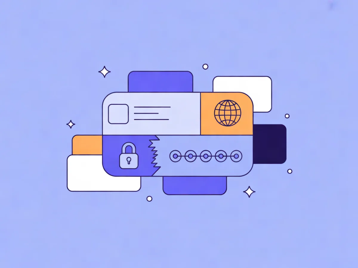
Email header and footer design covers the two fixed bands of your message: the header at the top (preheader text, logo, optional navigation, sometimes a "view in browser" link) and the footer at the bottom (sender identity, physical address, unsubscribe and preference links, legal text, social icons). Everything between them changes per campaign; these two zones usually don't. That's exactly why they deserve their own design pass instead of being whatever the template shipped with.
What email header and footer design actually covers
Think of an email as three stacked regions. The header is the top band: the preheader text that appears next to your subject line in the inbox, your logo, and optionally a short navigation row or a hero image. The footer is everything below the main content: who sent this, where they're legally based, how to stop receiving it, how to receive less of it, and where else to find you.
In most templates, header and footer are the only parts that stay identical across every send. The body is rewritten weekly; the bands are not. A logo that renders badly, a nav row that collapses on mobile, or an unsubscribe link that's technically present but visually buried will repeat that flaw across every campaign you send until someone fixes it at the template level.
That reuse is the whole argument for treating these bands as components rather than decoration.
Not sure your current tool is the right fit? Compare the Best Email Marketing Platforms by price, features and free plans for your exact list size.
Why these two bands carry more weight than they look
Three practical reasons.
They set trust. The header is the first thing a reader sees after the subject line, and the footer is the last. A header with a broken image placeholder and a footer with no identifiable sender reads as either careless or suspicious.
They carry the compliance elements that keep you sendable. Unsubscribe mechanics, sender identification, and a physical address are not branding choices — they're requirements in several jurisdictions and expectations from major mailbox providers. Get them wrong and the consequence isn't aesthetic.
They're reused, so small flaws compound. A 10px footer font is a minor annoyance once and a recurring accessibility problem across a year of sends.
The rest of this guide is about getting each element right, starting with the header.
The header: what to include
Logo placement and size
Top-left is the default expectation and the safest choice. Centered logos work for editorial or announcement sends where the email reads more like a letter than a storefront.
Practical constraints: keep the logo under roughly 200px wide so it doesn't dominate a 600px-wide email, export at 2x for retina displays, always set alt text to your brand name, and link the image to your homepage. That alt text matters more than most people assume — many inboxes block images by default, so for a meaningful share of readers, your alt text is your header.
Example: a 160×40px logo with alt="Northwind" wrapped in a link to https://northwind.example. If images are blocked, the reader still sees the brand name in text.
Preheader text and the "view in browser" link
The preheader sits next to the subject line in most inboxes. It's technically part of the header area even though you write it in your sending tool.
- Weak: "Having trouble viewing this email? View in browser."
- Better: "Three new templates, plus the layout fix we keep reusing."
The "view in browser" link is optional. It earns its place in long, layout-heavy sends where a client might mangle the design; it's noise in a short transactional email. If you include it, keep it small, place it above or beside the logo rather than pushing the logo down, and don't let it compete with your main call to action.
Navigation: when a header menu helps and when it hurts
Decide based on email type, not habit.
- Newsletters and retail sends often benefit from three to five text links.
- Transactional and lifecycle emails (order confirmations, password resets, onboarding steps) usually need none — the reader has one job.
Two things to avoid. First, image-based nav bars: they disappear when images are blocked and can't be read by screen readers unless you build in alt text for each item. Second, copying your full website menu into email — eight links in a 600px row will wrap awkwardly on a phone.
Example: a single row of four 14px text links — New, Best sellers, Guides, Sale — each with enough padding to give a comfortable tap target on mobile.
The footer: what to include
The footer is the compliance-and-trust zone. Most legal requirements live here, and the specifics vary by jurisdiction and by mailbox provider, so verify the current rules for your own situation rather than relying on a template you copied. The notes below are general guidance, not legal advice.
Sender identity and physical address
Sender identity in practice means the legal name of the business and a mailing address. In the United States, the FTC's CAN-SPAM compliance guide (ftc.gov/business-guidance/resources/can-spam-act-compliance-guide-business) states that commercial messages must include a valid physical postal address. That can be a street address, a post office box, or a registered commercial mail-receiving agency — check the current text for the exact wording.
GDPR and similar regimes approach identification differently, focusing on transparency about who is processing data and why. If you're in the EU or UK, check your own obligations with the relevant supervisory authority. Again: not legal advice.
Unsubscribe and preference links
Two decisions here. First, visibility: burying unsubscribe in 8px grey text is a bad trade. It doesn't meaningfully reduce opt-outs, and it increases the chance someone hits "report spam" instead, which damages your sending reputation. Second, one-click support: Gmail's and Yahoo's bulk sender guidelines expect a clearly visible unsubscribe and, for bulk senders, one-click unsubscribe support. Check the current versions of those guidelines on Google's and Yahoo's official sender pages, since the thresholds and requirements have been updated over time.
A preference center is a useful middle path — instead of losing the subscriber entirely, let them choose frequency or topics. Example: an unsubscribe link at the same font size as surrounding text, with "manage preferences" beside it, both in the same visual weight.
Legal and consent text
What typically belongs here: a one-line reason the recipient is receiving the email ("You signed up for the Northwind newsletter"), a copyright line, and a link to your privacy policy. If your consent model depends on recorded opt-in, GDPR expects you to be able to demonstrate that consent — see the official GDPR text or your supervisory authority's guidance for what records to keep.
Keep this to one or two lines and link out for detail. A wall of legal text in every send trains readers to ignore the whole footer, including the parts that matter.
Social links, contact details and secondary navigation
- Three to five icons maximum, each at least 32px with padding around it.
- Alt text naming the network ("Northwind on LinkedIn"), not "icon" or "social."
- Links must go to active profiles — a dead link in the footer is worse than no link.
- Include a contact route: a reply-to address or a support link. It gives frustrated readers somewhere to go that isn't the spam button.
- Secondary navigation is fine for retail and content brands, but keep it as text, not images.
How to build both bands without a designer
A workable process:
- Sketch the header and footer as two fixed blocks. Decide the elements once, in writing, before touching a builder.
- Build them once in a reusable template. Every campaign starts from that template, so the bands are never rebuilt.
- Lock them. Campaign edits happen in the body only. If someone needs a different footer, that's a new template, not a one-off tweak.
- Test the bands specifically: images off, dark mode, and a narrow viewport around 320–375px wide.
If you're working without a designer, a block-based editor makes step two straightforward — Mailerflow's visual block editor includes headings, heroes, products, columns and social links blocks alongside reusable templates, which fits the build-once-reuse pattern. If you'd rather start from a finished layout, the AI email builder generates a complete responsive design, subject lines and preview text from a short description, and you edit the header and footer from there.
For the body content between the bands, it's worth reading up on layouts that survive every inbox and on how fonts render across clients, since the same constraints apply to your header text.
Worked examples
These are illustrative, not customer stories.
A weekly newsletter. Header: logo left, four text nav links right. Footer: sender name, physical address, preference center link, unsubscribe, three social icons. Decision driver: repeat readers navigate by topic, so the nav earns its space; the preference center protects list health over a long subscription.
An order confirmation. Header: logo only, no nav. Footer: sender identity, address, a support link, and unsubscribe (transactional messages still need a way out in most regimes). Decision driver: the reader has exactly one task — confirm the order — so navigation is friction.
A re-engagement email. Header: logo plus a short "we've missed you" line. Footer: the preference center link is the primary call to action, styled as a button. Decision driver: the goal is to learn whether the subscriber wants less mail, not none.
Common mistakes
- Image-only headers with no alt text, so blocked images leave a blank band.
- Unsubscribe hidden in tiny grey text — an invitation to spam complaints.
- Missing physical address in commercial sends.
- Footer text so small it fails on mobile, where most opens happen.
- Social icons linking to abandoned profiles.
- The entire website menu copied into the header.
- Using the footer for a second hard sell, which dilutes the primary CTA.
- Inconsistent header and footer across templates, so the brand looks different every week.
- Ignoring dark mode, where a dark logo on a dark background vanishes.
- Critical legal text placed inside an image, where it can't be read, searched, or blocked-image-proofed.
Checklist before you send
- [ ] Logo is under ~200px wide, exported at 2x, with alt text set to the brand name.
- [ ] Logo links to the homepage.
- [ ] Preheader written and distinct from the subject line.
- [ ] Header navigation included only if the email type justifies it.
- [ ] Nav built as text links, not an image.
- [ ] Sender legal name and physical address present.
- [ ] Unsubscribe visible at normal body font size.
- [ ] Preference center link beside unsubscribe.
- [ ] One-line reason-for-receiving and a privacy policy link.
- [ ] Three to five social icons, each with named alt text and a live destination.
- [ ] A contact route (reply-to or support link).
- [ ] Footer legible at 320px wide.
- [ ] Dark mode contrast checked.
- [ ] Images-off test still communicates brand and sender.
FAQ
Does every email need a footer? Practically, yes. Even transactional messages benefit from sender identification and a contact route, and most commercial messages need unsubscribe mechanics and a physical address under regimes like CAN-SPAM. The contents can shrink for transactional sends — drop the nav and social icons, keep identity, contact, and opt-out.
How big should a header logo be? Under roughly 200px wide is a safe ceiling for a 600px email. Export at 2x for retina screens, and check that the file size stays small — a heavy logo slows rendering on mobile connections.
Can I use an image for my navigation? You can, but you shouldn't. Images are blocked by default in many inboxes, and image nav bars are hard to make accessible. Text links with padding render everywhere and stay readable.
Where exactly should the unsubscribe link go? In the footer, at the same font size as surrounding text, clearly labeled as unsubscribe. Gmail's and Yahoo's bulk sender guidelines expect it to be easy to find, and for bulk senders, one-click support — check the current official guidelines for your sending volume.
Do I need a physical address if I'm a solo business? CAN-SPAM requires a valid physical postal address in commercial messages, and a PO box or registered mail-receiving agency can qualify. If you work from home and don't want to publish that address, a PO box is the usual workaround. Confirm the current requirement on the FTC's guide.
Do social icons in the footer actually help? They help when the profiles are active and relevant to the audience; they hurt when they lead to a page last updated two years ago. If you can't maintain a channel, leave its icon out.
Generate a complete, on-brand email from a short description with Mailerflow's AI email builder — free plan available. You can then adjust the header and footer once in your template and reuse them across every campaign.