
How to Generate Email Designs From Your Website Style
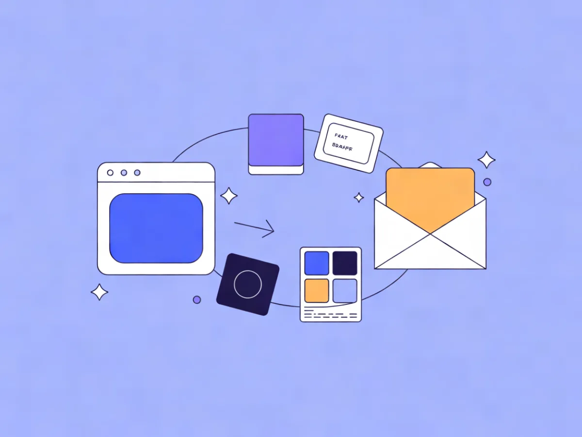
You can generate an email design from your website by extracting a small design system — two or three colors, one heading font, one body font, a button style — and rebuilding it inside email's constraints: roughly 600px wide, inline-friendly styling, and web-safe font fallbacks. The goal isn't to clone your site pixel for pixel; it's to make the email feel like it came from the same brand.
What you'll set up and what you need
Gather these before you start:
- Your site URL, and one representative page (homepage or a product page)
- Brand hex codes — or a way to sample them (browser dev tools, a color picker extension)
- Font names for headings and body, plus a web-safe fallback for each
- Your logo as PNG or SVG with a transparent background
Two constraints shape everything. First, email clients don't reliably load external CSS or web fonts, so every font needs a fallback and styling has to survive without your stylesheet. Second, keep the content column around 600px — wide enough for a two-column block, narrow enough for phones.
If you don't have a designer, don't try to reproduce the whole site. Extract a minimal system: 2–3 colors, 1 heading font, 1 body font, 1 button style. That's enough to match email to website brand without a style guide. If you'd rather start from a description than a blank canvas, Mailerflow's AI email builder takes a written brief and returns a complete responsive design along with subject lines and preview text.
Step-by-step: build the email from your site's style
1. Sample your colors
Open your site, right-click the elements you care about, and inspect. You want four values:
| Role | Where to sample | Example |
|---|---|---|
| Background | Page background | #FFFFFF |
| Body text | Paragraph text | #1F1A17 |
| Accent / button | Primary CTA on site | #B4552D |
| Neutral surface | Cards, section fills | #F4EFE9 |
Verify: paste each hex into a contrast checker against the background. Body text should hit at least 4.5:1.
2. Pick fonts and fallbacks
Note the site's heading and body fonts, then write a fallback stack for each. If your site uses a custom serif, your stack might be Georgia, 'Times New Roman', serif. For a sans-serif, Arial, Helvetica, sans-serif.
Verify: temporarily remove the web font from your stack and read the email. If it still looks intentional, the fallback works.
3. Set the canvas
- Content width: 600px
- Body text: 16px, line height 1.5
- Section padding: 24–32px
- Background: white or your neutral
Verify: preview at 320px width — text should reflow without horizontal scrolling.
4. Build the header
Place your logo at a fixed height (40px is a good default), left- or center-aligned, linked to your site. Add a short alt text.
Verify: turn images off in your email client. You should see the alt text, not a broken icon.
5. Build the body blocks
A reliable sequence: hero, one text block, one product or content block, one CTA button. For the button:
- Background: your accent hex
- Text: white
- Padding: 14–16px
- Corner radius: 4–6px
Verify: the button should be at least ~44px tall so it's tappable on a phone.
6. Add the footer
Include your physical address, an unsubscribe link, a preference center link, and social links.
Verify: click every link in a test send. Unsubscribe should work in one click.
7. Save it as a template
This is the step people skip. Save the finished email as a reusable template so the next campaign starts from the same base. In Mailerflow, this lives in the visual block editor — headings, heroes, products, columns, social links — with reusable templates alongside it.
A worked example: a fictional coffee subscription
The following is an illustrative example, not a real customer.
Say you run Ridgeline Coffee, a subscription site. Sampling the site gives you this system:
| Token | Value |
|---|---|
| Background | #FFFFFF |
| Text | #1F1A17 |
| Accent | #B4552D |
| Neutral | #F4EFE9 |
| Heading font | Georgia, serif |
| Body font | Arial, sans-serif |
| Logo height | 40px |
Now build a win-back email:
- Subject: Your Ridgeline order is on pause
- Preview text: One tap to restart — your roast is still saved.
- Hero headline: Still want your beans?
- Paragraph: Your subscription is paused, so nothing ships this month. Your roast and grind settings are saved.
- Two-column block: left column, a bag image; right column, "Ethiopia Guji, medium roast, whole bean."
- Button: "Restart my subscription" —
#B4552Dbackground, white text - Footer: address, unsubscribe, preferences, social links
Then reuse the same system for a shipping notification: same header, same fonts, same button style, different copy. That's the test of a real system — the second email takes minutes, not an afternoon.
Tone matters as much as color. If the site copy is warm and plain-spoken, the email should be too. Instead of "We regret to inform you that your subscription has been suspended," write "Your subscription is paused — nothing ships this month."
How to check it works
Run this checklist before your first send:
- Send test emails to yourself plus at least one Gmail and one Outlook address.
- Check three widths: 320px, 600px, and full desktop.
- Block images in your client settings and confirm the layout still reads.
- Tap the button on a phone — it should be easy to hit without zooming.
- Disable web fonts and confirm the fallback stack holds up.
- Click every link, including UTMs, and confirm the destination pages.
- Test dark mode. Some clients invert backgrounds; make sure your text doesn't disappear.
- Confirm the footer has your address and a working unsubscribe.
After the first real send, compare click behavior against your usual numbers. Mailerflow analytics cover delivery, bounces, complaints, clicks and approximate opens per campaign and overall, so you can see whether the new design changed how people engage. For a more thorough pass, work through a responsive email design checklist before you scale up.
Common mistakes and fixes
Low contrast on colored backgrounds. Copying your site's text color onto a colored block often fails. Check the ratio and aim for 4.5:1 on body copy.
Thin web fonts that vanish in Outlook. Outlook frequently ignores web fonts. Set a heavier fallback and test with fonts disabled.
Building 1200px wide. That's a website, not an email. Keep the content column at 600px.
One giant image for the whole email. If images are blocked, the reader sees nothing. Split the design into text and image blocks.
Inconsistent buttons between campaigns. Different radius, different padding, different color. Fix it by saving the template and reusing it.
No plain-text version. Some readers and filters prefer it. Most builders generate one — check that it exists.
A footer designed to hide the unsubscribe. It hurts deliverability and trust. Keep it legible.
Copying every site detail. Drop shadows, hover states, and animation don't translate. Match the system, not the ornament.
Scaling the system beyond one email
Once one email works, turn it into a repeatable system:
- Lock the colors and fonts in your template so future emails stay consistent.
- Create two or three variants from the same base — promotional, transactional, newsletter.
- Keep a one-page brand note with hex codes, fonts, and tone rules so anyone can build the next email.
This is also where automation pays off. Mailerflow's AI automation builder drafts a workflow from a sentence — trigger, waits, conditions, emails — for you to review before activation, so the same branded emails can be reused across a welcome or win-back sequence. Dynamic segments and website-behavior data keep the content relevant to what each contact actually read or did, without changing the design system underneath.
FAQ
Can I use my website's web fonts in email? Partly. Some clients load them, many block them. Always set a web-safe fallback stack so the email looks intentional either way.
How do I find my brand's hex codes? Use your browser's dev tools to inspect an element, or install a color picker extension. Sample the background, body text, accent, and one neutral.
Do I need a designer to do this? No. A two-color, two-font system with one button style covers the vast majority of marketing emails.
How wide should an email be? Around 600px for the content column. That fits most desktop clients and reflows cleanly on phones.
Will my email look the same in every client? No. Gmail, Outlook, and Apple Mail all render differently. Test in the main ones rather than chasing pixel-perfect parity.
Should the email match the site exactly? Match the system — colors, fonts, tone, button style — not every detail. Email has different constraints, and readers expect that.
Next steps
Build one email from your extracted system today, send yourself a test, and save it as a template. From there, the natural next moves are a welcome automation, a signup form with double opt-in, and a look at your analytics after the first send. If you want to try the builder without cost, Mailerflow's free plan covers 2,500 contacts and 10,000 emails a month; paid plans start at $14.90/month with unlimited emails.
Describe your next email or automation in one sentence and let Mailerflow's AI build it — free plan, no credit card.