Checklist Lead Magnets: How to Build One That Converts (With Examples)
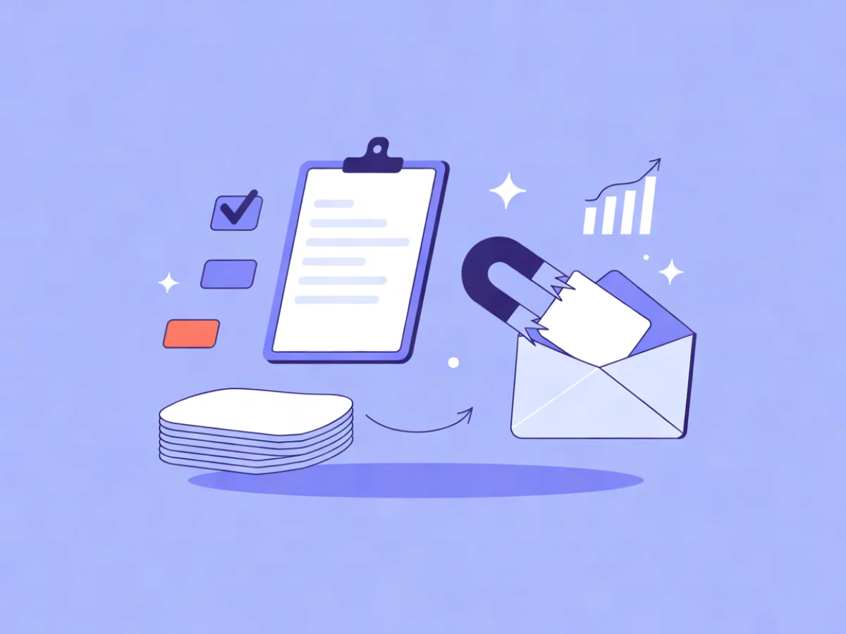
A checklist lead magnet is a short, scannable list of items a reader can tick off to complete a task or reach a decision — and it converts because the value is visible before the opt in. The title tells the reader what they'll be able to finish, the format tells them it will take minutes, and the items themselves show them the gaps in what they've already done. That combination is hard to beat for email signups.
What a checklist lead magnet actually is
A checklist is a sequence of actions with a finish line. That's the whole definition, and it's why the format behaves differently from other incentives.
Compare it to its neighbours:
- An ebook teaches a subject. The reader has to invest time before they know whether it was worth it.
- A template removes work. Useful, but it only helps if the reader already knows what they're doing.
- A swipe file collects examples. Great for inspiration, weak on direction.
- A cheat sheet compresses reference material. You consult it; you don't complete it.
- A checklist gives the reader a path and a sense of progress. Every tick is a small win, and the last tick means done.
That's the psychological engine. The reader scans the list, recognises two or three items they haven't handled, and now has a reason to act today rather than eventually. The checklist doesn't just promise information — it promises completion.
Why checklists convert for email signups
The conversion logic is straightforward: perceived effort is low, and the payoff is legible from the title alone.
A 40-page ebook asks the reader to trust you. A checklist asks them to glance at ten lines. If those ten lines are specific — "Set a reply-to address," not "Think about deliverability" — the reader can judge the usefulness before handing over an email address. That's rare among lead magnets, most of which are opaque until download.
There's also a gap effect at work. A checklist makes the reader aware of steps they haven't taken. Awareness of a gap is uncomfortable, and the cheapest way to close it is to grab the list. You're not manufacturing urgency; you're surfacing work that already exists.
The checklist opt in moment deserves its own attention. The form should state exactly what arrives and when: "Get the 12-point pre-launch checklist as a PDF, plus one short email a week on shipping client sites." Vague forms ("Download our free guide") leave the reader guessing, and guessing kills signups.
Finally, checklists work well as a second-step offer. Someone who isn't ready for a demo or a purchase will often trade an email address for a practical list. It's a low-commitment entry point that keeps the relationship alive until the buying moment arrives.
How a checklist lead magnet fits your funnel
The download is the start, not the end. Here's the mechanics that matter after the opt in:
- Confirmation. If you're collecting consent in a region that requires it, use double opt-in and keep a consent record. Mailerflow's embeddable signup forms support double opt-in and consent records, which removes a chunk of manual bookkeeping.
- Delivery. Send the file immediately, attached or linked, with a plain-text version inline for people who read on mobile.
- Tagging. Apply a tag on signup so you know this contact arrived through the checklist, not through a blog post or a webinar.
- Follow-up. Write a short sequence that walks through the checklist items one at a time, ending with your next offer.
- Segmentation. Checklist downloaders behave differently from other subscribers. Mailerflow's dynamic segments work on fields, tags, engagement, events and website behaviour, and you can also describe a segment in plain language and let AI build it. That lets you send the follow-up only to people who actually took the checklist, and route the rest elsewhere.
If you want to see how these pieces connect, the feature overview covers forms, automations and segmentation in one place.
Step-by-step: build a checklist lead magnet in an afternoon
- Pick one narrow outcome. "Launch a welcome sequence" beats "Email marketing." The narrower the outcome, the more obviously the checklist applies to the reader's situation.
- Write the title as a promise with a number and a timeframe. "The 12-point pre-launch website checklist (about 40 minutes)." Numbers set expectations; timeframes reduce friction.
- Draft 7–15 items. Each starts with a verb. Each is independently actionable — a reader should be able to do item 6 without having done item 4.
- Order by sequence, not importance. If item 3 has to happen before item 7, put it there. Readers follow lists top to bottom.
- Add a one-line "why this matters" only where the item is non-obvious. Most items don't need it. Explanations turn a checklist into an article.
- Design for one page or one screen. Checkboxes, generous spacing, no dense paragraphs. If it spills to three pages, cut items or split the topic.
- Add a footer call to action. One line pointing to the logical next step: a template, a tool, a call.
- Export as PDF and write a plain-text version. The PDF is the artifact; the plain-text version goes in the delivery email so the reader can start without opening a file.
- Set up the form, confirmation and delivery email. Test with a real address, not a preview.
- Run the full flow end to end. Check the confirmation link, the file, the tag, and the first follow-up. Fix anything that looks off before you promote it.
Decisions that shape the result
- Length. One page for most topics. Multi-page only when the process genuinely has phases (a launch, an audit). Recommendation: start at one page and expand only if readers ask.
- Format. PDF is the default. A Notion page or Google Doc works if your audience lives there and you want the checklist to be duplicable. Email-only works when the list is short and you want zero friction.
- Gating. Gate the full checklist for list growth; show the first three items on the landing page so the reader can judge quality. Partial gating usually outperforms a total blackout because it proves the value.
- Naming. Lead with the outcome ("Ship a landing page without missing the basics") rather than the topic ("Landing page checklist"). Outcome-led titles describe the reader's life after the list.
- Product inclusion. Mention your product in at most one item, and only if it genuinely removes work. A checklist that reads as a sales document loses the trust the format depends on.
Examples you can adapt
These are illustrative, not results from real customers — use them as starting points.
Freelance designer: "The 12-point pre-launch website checklist." Audience: small business owners about to go live. Items cover favicon, meta descriptions, 404 page, contact form test, analytics installed, redirects. Follow-up offer: a website handover template.
B2B SaaS: "Onboarding email audit checklist." Audience: lifecycle marketers reviewing an existing sequence. Items cover trigger timing, first-value moment, plain-text fallback, unsubscribe clarity, mobile rendering. Follow-up offer: a sequence-mapping worksheet.
Ecommerce brand: "Product page conversion checklist." Audience: store owners with traffic but weak add-to-cart rates. Items cover above-the-fold imagery, shipping cost visibility, review placement, size guidance, returns policy link. Follow-up offer: a product photography brief.
Consultant: "Discovery call prep checklist." Audience: agency owners booking their first sales calls. Items cover researching the prospect, writing three questions, setting the agenda, testing the meeting link, preparing a follow-up template. Follow-up offer: a proposal outline.
Newsletter: "Weekly publishing checklist." Audience: solo writers building an audience. Items cover subject line drafted, preview text written, links tested, plain-text version checked, send time scheduled. Follow-up offer: a 12-week content calendar.
Notice the pattern: each title names the audience's situation, each list is short enough to finish, and each has an obvious next step.
Common mistakes
- Too broad a topic. "Marketing checklist" helps no one. Fix: narrow until the title describes one finished task.
- Items that are advice, not actions. "Understand your audience" can't be ticked. Fix: rewrite as a verb the reader can complete in one sitting.
- 40-item lists nobody finishes. Length signals effort. Fix: cut to 7–15 items and move the rest into a follow-up email.
- No next step after download. The checklist ends and the relationship stalls. Fix: add a footer CTA and a follow-up sequence.
- A delivery email without the file. The most common technical failure. Fix: test the flow with a real inbox before promoting it.
- No double opt-in or consent record where required. Fix: configure confirmation and consent logging in your form before launch.
- The same follow-up for everyone. Someone who downloaded a design checklist and someone who downloaded a sales checklist need different emails. Fix: tag on signup and segment your sequence.
- A checklist that reads like an ebook. Paragraphs, subheadings, background context. Fix: strip everything that isn't a tickable item.
Your checklist for shipping the checklist
- [ ] Outcome is specific and named in the title
- [ ] Title states a number and a result
- [ ] 7–15 items, each starting with a verb
- [ ] Fits on one page or one screen
- [ ] Footer CTA points to the next step
- [ ] Delivery email tested with a real address
- [ ] Double opt-in and consent record configured where required
- [ ] Tag applied automatically on signup
- [ ] Follow-up sequence written and scheduled
- [ ] Segment created for checklist downloaders
- [ ] Plain-text version ready for the delivery email
FAQ
How long should a checklist lead magnet be?
Long enough to cover the task, short enough to finish in one sitting. For most topics that's 7–15 items on a single page. If you need more, consider splitting into two checklists and using the second as a follow-up offer.
Should I gate the whole checklist or part of it?
Showing the first few items on the landing page usually works better than hiding everything, because it lets the reader judge quality before opting in. Gate the full list, not the concept.
Do I need double opt-in?
It depends on where your subscribers are and what your legal basis is. If you rely on consent, double opt-in plus a consent record is the safer route. Mailerflow's embeddable signup forms support double opt-in and consent records, so you can configure it at the form level rather than tracking it manually.
What file format works best?
PDF for the artifact, plus a plain-text version in the delivery email. If your audience works in Notion or Google Docs, a duplicable page can be more useful than a PDF, but PDF remains the most portable default.
Can I reuse a blog post as a checklist?
Yes, if you rewrite it. Extract the actions from the post, drop the explanations, and turn each action into a verb-led item. A post that reads well usually contains a checklist that reads better.
How do I know if it's working?
Watch three things: signup rate on the landing page, delivery and click rates on the delivery email, and how many downloaders take the next step in your sequence. Compare those numbers against your other lead magnets rather than against any external benchmark.
Add an embeddable signup form with double opt-in and build dynamic segments in Mailerflow — start free.